
Instagram has rebranded—but the headline needs one important correction
Instagram ka latest visual change sirf ek logo-news story nahi hai. It is a useful branding case study for every business that has ever asked, “Should we modernise our identity, or will customers stop recognising us?”
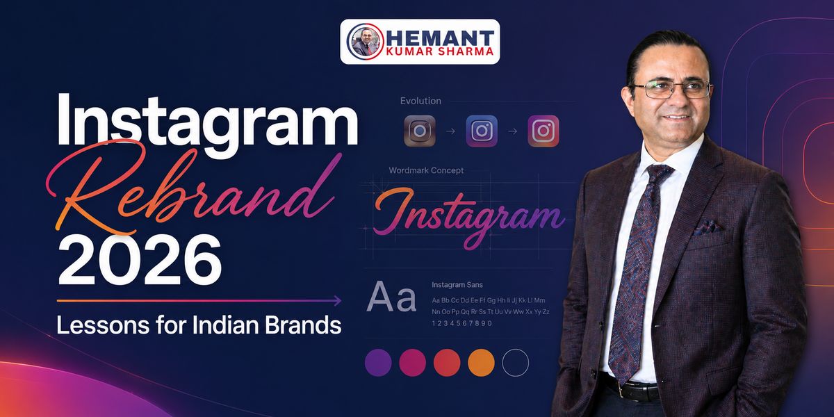
Meta officially announced Instagram’s refreshed brand identity on Aug 13, 2026. The company introduced a redesigned wordmark—the written “Instagram” name—and a broader brand system covering typography, motion, layout, interface treatment and colour usage. According to Meta, this is Instagram’s first brand-identity refresh in over ten years.
However, one detail deserves clarity. The familiar gradient camera glyph used as the Instagram app icon has not been replaced in this announcement. Calling the update a “new Instagram logo” may attract attention, but “new wordmark and refreshed brand system” is more accurate.
That distinction matters because branding is not one image. A brand identity is a working system: name presentation, type, colours, motion, layout, photography, interface behaviour and the rules that help all these elements work together.
What exactly has changed in Instagram’s new brand identity?
- A refreshed Instagram wordmark that keeps the script character but makes it bolder and simpler.
- An updated Instagram Sans typeface.
- A new handwriting-inspired typeface called Instagram Pen.
- A new monospaced typeface called Instagram Mono.
- More restrained use of Instagram’s famous gradient.
- Refreshed motion, layout and user-interface treatments.
- A wider visual system designed to give community-created content more space.
- A global rollout of the wordmark, with the complete system continuing through 2026 and beyond.
Meta says its team explored hundreds of directions, including all-capital lettering, camera-based concepts and literal handwriting. It repeatedly returned to crafted script because that visual language still felt recognisably Instagram.
This is the first strategic lesson: a mature brand does not have to destroy its past to prove that it understands the future.
What has not changed?
- The recognisable camera glyph remains the app icon at the time of the announcement.
- Script remains central to the Instagram wordmark.
- The gradient remains part of the brand, although it is used more selectively.
- Creativity, self-expression and connection remain the stated brand principles.
The refresh is therefore evolutionary, not revolutionary. Instagram has changed the way its identity behaves without cutting the visual thread that connects the current platform to its history.
Why would Instagram refresh its identity after more than a decade?
Instagram in 2016 and Instagram in 2026 are not the same product experience. The platform has moved far beyond square photographs and filters. Reels, Stories, Notes, messaging, creator collaborations, shopping-related discovery and multiple publishing formats now live within the same ecosystem.
When a product expands, its identity system must work in more places and under more conditions. A wordmark may appear in a product header, campaign film, event, creator collaboration or small mobile space. Typefaces must support interface labels, expressive storytelling and technical information. Motion must feel recognisable without overpowering what a creator has made.
Instagram’s response is not to make the brand louder. It is to make the system more flexible and comparatively quieter.
The official design explanation says the refreshed direction creates more room to breathe so the community’s work carries the energy. This is a meaningful choice. Many brands try to appear modern by adding gradients, animation, visual effects and decorative templates. Instagram is showing the opposite route: when the content is the hero, the identity should frame it—not fight with it.
The deeper design idea: human expression in an increasingly automated world
Instagram Pen is especially interesting. It is a handwriting-inspired typeface developed from experimentation with physical writing tools and different styles of marks. The wider system also uses photographic references such as contact sheets, annotations and viewfinder-like framing.
This does not prove that the refresh is a direct reaction to artificial intelligence, and the company has not framed it that way in its official announcement. Still, the strategic direction is clear: individuality, human touch and the act of making are being placed at the centre of the identity.
For businesses, this is timely. Jab markets generic AI-written captions, similar Canva templates aur repeated stock visuals se bhar jaate hain, perfection alone does not create trust. A recognisable point of view, a consistent voice and evidence of genuine human judgement become more valuable.
Why did the new wordmark receive mixed reactions?
Large rebrands are rarely judged calmly on day one. Familiarity creates emotional ownership, even among people who have never worked for the brand.
Some viewers have praised the new wordmark as cleaner and more modern. Others have questioned its legibility, particularly the shapes around the letters “r” and “g”. The joking nickname “Instagzam” quickly appeared in online reactions.
This criticism should not be dismissed. A wordmark must remain readable across screens, sizes, languages and reproduction conditions. At the same time, immediate discomfort does not automatically mean a rebrand has failed. People often compare a new identity, seen for a few minutes, with an older identity strengthened by ten years of repeated exposure.
The sensible test is not whether everyone likes it today. The real test is whether the system remains distinctive, usable, accessible and recognisable after sustained use.
There is also an ethical communication point here: we should not claim that Instagram deliberately designed a confusing letter merely to generate publicity. The debate created attention, but there is no reliable evidence that confusion was the intended strategy.
Eight practical branding lessons for Indian businesses
1. Rebrand only when the business has changed—not because the logo feels old
A visual refresh should solve a business or communication problem. Perhaps the company now serves new markets, offers more services, operates digitally, needs better mobile visibility or suffers from inconsistent communication. “We are bored with our logo” is a weak reason to spend money and disturb recognition.
Before redesigning, document what has changed in the business and what the existing identity can no longer handle.
2. Protect the assets customers already recognise
Instagram tested many alternatives but retained the script idea and core gradient. This protected memory while allowing modernisation.
For an Indian family business, clinic, consultant, manufacturer or education brand, the most valuable asset may not be the entire old logo. It may be a colour, name style, symbol, founder’s signature, packaging cue, shop-board shape or familiar phrase. Identify that memory asset before a designer starts exploring.
3. Build a brand system, not a single logo file
A logo alone cannot keep Instagram posts, brochures, presentations, websites, WhatsApp creatives, videos and advertisements consistent.
A practical identity system should define:
- Primary and secondary logo usage.
- Colour palette and contrast rules.
- Heading, body and regional-language typography.
- Photography and illustration direction.
- Templates for social media, proposals and presentations.
- Motion rules for Reels and video.
- Tone of voice and message hierarchy.
- Minimum sizes, spacing and misuse examples.
If a designer delivers only PNG and JPG files, the business has received artwork—not a complete brand system.
4. Let customer value remain the hero
Instagram’s refreshed system is designed to step back so creators and their work can take centre stage. Businesses should ask the same question: does our design help customers understand the offer, or does it merely display the designer’s skill?
The best landing page, social creative or brochure is not the one with the most effects. It is the one that makes the promise, proof and next step easy to understand.
5. Test legibility in real Indian conditions
Do not approve a wordmark only on a large designer’s monitor. Test it on a budget Android phone, WhatsApp preview, Instagram profile, Google Business Profile, printed invoice, small packaging label and outdoor board.
If the brand works in Hindi, Hinglish or another Indian language, examine mixed-script typography carefully. A stylish English font paired with a weak Devanagari font can make the identity feel disconnected. Test older users, lower-resolution screens and fast-scrolling behaviour as well.
6. Roll out in phases instead of changing everything overnight
Instagram’s broader identity is being introduced through 2026 and beyond. A phased rollout helps a large organisation protect consistency while updating many touchpoints.
Indian SMEs can follow a smaller version of this process:
- Freeze the approved master assets.
- Update the website and primary social profiles first.
- Replace sales and proposal templates next.
- Update signage, packaging and printed stock according to operational priority.
- Maintain a transition note so old and new assets are not used randomly.
This reduces waste and prevents five different versions of the brand from circulating at the same time.
7. Explain the reason behind the change
People accept change more readily when they understand its purpose. A short founder video or post can explain what is changing, what is staying and how the refresh reflects the company’s next chapter.
Avoid dramatic claims such as “We have completely transformed” when only the logo has changed. Honest explanation earns more credibility than inflated launch language.
8. Treat reactions as research, not as a referendum
Comments after a rebrand reveal where recognition, readability and emotional attachment live. Listen to recurring patterns, not isolated jokes. Fix genuine usability problems, but do not redesign the identity every time an online poll becomes uncomfortable.
The brand team must distinguish three things: resistance caused by unfamiliarity, criticism caused by a real functional problem and dislike based purely on personal taste.
A 30-day rebrand-readiness audit for business owners
Before approving a redesign, review these points:
- Business change: What strategic change makes a refresh necessary now?
- Customer recognition: Which existing visual or verbal cues do customers remember?
- Touchpoint inventory: Where will the identity appear online and offline?
- Mobile test: Does it work at profile-photo, thumbnail and WhatsApp-preview size?
- Language test: Does it remain coherent across English and Indian-language communication?
- Accessibility test: Are contrast, readability and text size practical?
- Content test: Can photographs, videos, offers and educational posts remain the focus?
- Template test: Can ordinary team members use the system correctly?
- Transition plan: Which assets change first, and who controls final files?
- Measurement plan: Will you monitor branded search, direct traffic, profile actions, enquiries and customer confusion after rollout?
A rebrand should make the business easier to recognise and easier to operate. If the new system creates more inconsistency than the old one, the project is not ready.
What should marketers and creators do about Instagram’s refresh?
There is no reason to redesign every Instagram post merely because Instagram has changed its own wordmark. The platform’s visual identity is not a compulsory template for user content.
Instead, use the moment to review your own profile:
- Check whether the profile image remains clear at small size.
- Strengthen the first line of the bio and the business promise.
- Remove outdated highlight covers and inconsistent templates.
- Standardise the hierarchy used in carousels and Reels covers.
- Make captions sound like a recognisable person or brand, not a content machine.
- Use fewer decorative elements when they compete with the message.
- Keep original brand files and usage rules accessible to the team.
- Use Instagram’s trademark assets only according to its official brand guidance.
Most importantly, do not present the rebrand as evidence of an algorithm change. The brand-identity announcement does not establish any automatic change in reach, ranking, advertising performance or content distribution. Visual news and algorithm news are different subjects.
My professional view: this is a lesson in disciplined evolution
The strongest aspect of Instagram’s refresh is not whether one likes every letter in the new wordmark. It is the decision to preserve recognisable equity while creating a system suitable for a much broader platform.
The most debatable aspect is legibility. Distinctiveness is valuable, but a wordmark should not make people work unnecessarily hard to read the name. This tension makes the refresh more useful as a case study: branding decisions are rarely a contest between “old” and “new”. They are a balance between recognition, expression, usability and future flexibility.
For Indian businesses, the practical takeaway is simple: do not copy Instagram’s design. Copy the seriousness of its process. Explore widely, identify the non-negotiable memory assets, test in real conditions, build a usable system and roll it out with control.
Conclusion
Instagram’s 2026 rebrand is more than a changed piece of lettering. The refreshed wordmark, expanded typography, restrained gradient and creator-first design system show how a global brand can modernise without abandoning its heritage.
A successful rebrand does not erase familiarity. It makes familiarity work harder for the next stage of growth.
Need clarity before changing your brand or social-media identity?
If your logo, website, social creatives and business message no longer feel aligned, a structured brand-and-content review can identify what should be retained, what should change and what may be hurting recognition. Explore the consulting and mentoring work of Hemant Kumar Sharma at hemant.co.in or call/WhatsApp +91 98116 81687.
Sources and verification notes
- Design at Meta — Built to celebrate creativity: the new Instagram brand identity. Official announcement covering the wordmark, typography, gradient, motion, layout and rollout.
- It’s Nice That — Behind Instagram’s first major refresh in over ten years. Partnership feature examining the design process and visual system.
- Creative Boom — Instagram reveals its first brand refresh in 10 years. Independent design-industry coverage of the changes and public reaction.
- TechCrunch — Instagram introduces a redesigned wordmark. Technology-news coverage clarifying the wordmark change and unchanged app icon.
Editorial note: This article distinguishes verified product-brand facts from professional interpretation. It does not claim that the refresh changes Instagram’s recommendation algorithm, organic reach or advertising performance.